You know the drill: you queue up a doc, stash it in the background, code runs muted, sketching happens half-awake. But if you’re treating design documentaries like ambient noise, you’re missing the part where the messy, uncomfortable design stuff happens. The gravity. The grind. The rollout screw-ups. Because great design isn’t born in perfect shots of cafés and MacBooks — it’s forged in tension, iteration, culture collisions, and yes, a healthy dose of creative rebellion.
What you deserve is more. You deserve documentaries that do more than show pretty visuals: ones that expose process, failure, branding tension, typography thinking, minimalism, culture clash — all of it relevant to your world of logos, apparel, web, music, and yes, creative rebellion. So here are 10 picks that won’t just entertain you, they’ll sharpen your edge. Let’s dig in.
Abstract: The Art of Design
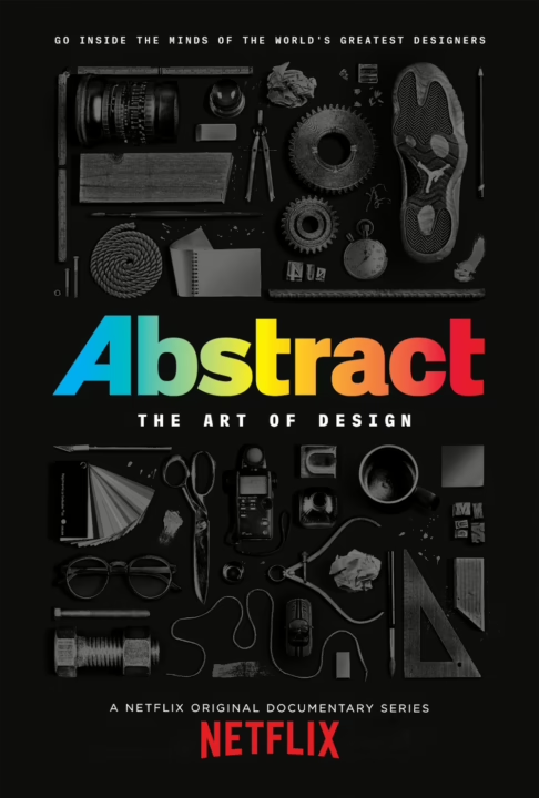
What it is: One of the flagship design documentaries on Netflix that goes inside the work of high-level designers across fields (including graphic design).
Why it matters: It gives you process over polish – how great design is crafted, how decisions ripple out into brand, web, print.
For you: Builds the mindset that visual work isn’t just “make it look good,” it’s about intent, history, and impact.
Pro tip: Focus the episode on the graphic designer (for example, who did brand identities), take notes on how typography, context, and constraints played out.
Minimalism: A Documentary About the Important Things
What it is: A film-style doc on minimalism in life, design, and choices.
Why it matters: As a designer, you’ll often face pressure to add more: more colour, more effects, more “look at me.” This flips that.
For you: When you’re sketching apparel logos or landing page layouts — remember: “less” can be far stronger.
Pro tip: After you finish, challenge your next design: “If I remove half my elements, what’s strongest?”
The Toys That Made Us
What it is: Not one of the more blatant design documentaries, but certainly a worthy doc-series on the history of major toy franchises (branding, culture, design).
Why it matters: Nostalgia, packaging, brand legacy – all relevant when you design apparel or logos tied to culture.
For you: Think about how a simple action-figure packaging or toy campaign can offer lessons for an apparel drop or web launch.
Pro tip: Watch an episode, then ask: How did the toy’s visuals reflect broader culture or audience desire? How could that inform your next branding move?
Print the Legend
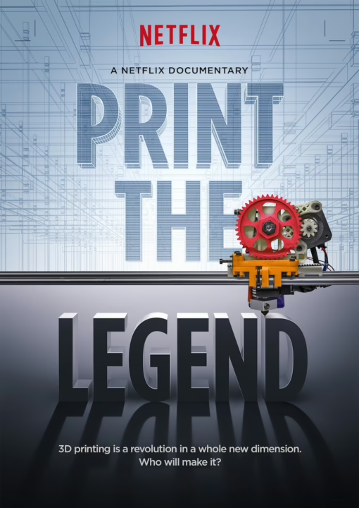
What it is: A documentary about the race in 3-D printing and how design + tech collide.
Why it matters: You’re a full-stack dev & designer — bridging tech and visuals. This one shows how design tech evolves and what it means for craft.
For you: Think of your CSS systems, your typography/spacing tokens, your apparel print methods — this is the same mindset of “innovate process.”
Pro tip: Extract one process improvement from the doc: How did a designer or business streamline or rethink design delivery?
Struggle: The Life and Lost Art of Szukalski

What it is: One of the lesser-known “design documentaries” on a forgotten sculptor/artist and the intersections of art, identity, and legacy.
Why it matters: For designers who think “how do I stand out?” – this shows how unconventional visual voices matter.
For you: Your apparel/logos/web work benefits when you pull from unexpected art influences.
Pro tip: After watching, pick one visual idea from the film and ask: How would I translate it into a tee print or web header?
They’ll Love Me When I’m Dead
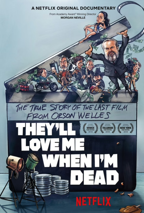
What it is: A documentary about the making (and un-making) of Orson Welles’s final film — creative ambition vs. real world.
Why it matters: Creative vision is sexy; business & constraints are brutal. Good design work happens when you negotiate both.
For you: Whether you’re working on a client’s website, an apparel line, or a music-branding project — know the tension and plan for it.
Pro tip: Note one moment where the vision was compromised, and ask: How could a designer have anticipated or mitigated that?
The B‑Side: Elsa Dorfman’s Portrait Photography
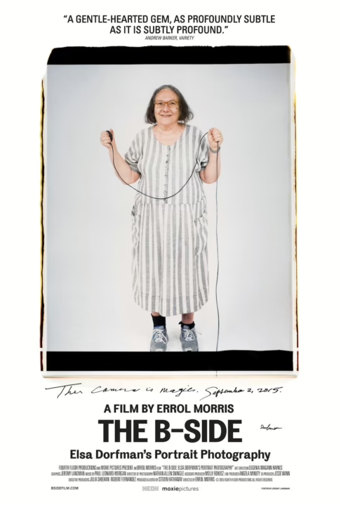
What it is: A film about a photographer who used large format Polaroids and built an archive of identity and image.
Why it matters: Design isn’t only fonts + logos + code — it’s also framing, image-as-identity.
For you: If you ever design apparel with photography, build a web section with rich visuals, or produce music branding, this helps your eye.
Pro tip: Pick one photograph from the doc and dissect: what framing, lighting, context makes it ‘brand-worthy’?
The Creative Indians
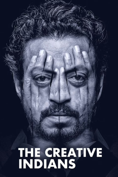
What it is: A series featuring Indian creatives (chefs, fashion designers, filmmakers) telling their stories.
Why it matters: Expands your cultural palette. Design is global; your next logo or apparel line might tap a different cultural reference.
For you: Use this to pull fresh inspiration and avoid the design echo chamber.
Pro tip: Take one episode and extract one cultural visual motif or process you hadn’t seen before — how could you adapt it?
Bob Ross: Happy Accidents, Betrayal & Greed
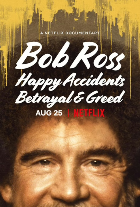
What it is: A documentary on Bob Ross’s brand, business, art, and how the “happy little trees” façade masked complexity.
Why it matters: Brand, art, visual identity — all bundled. You design apparel and logos. You’re partly building a brand.
For you: Reflect on your “visual brand promise” — what are you selling, and what are you hiding?
Pro tip: Consider the Bob Ross brand: friendly, approachable, non-threatening. How might you flip that for your next line?
The Andy Warhol Diaries
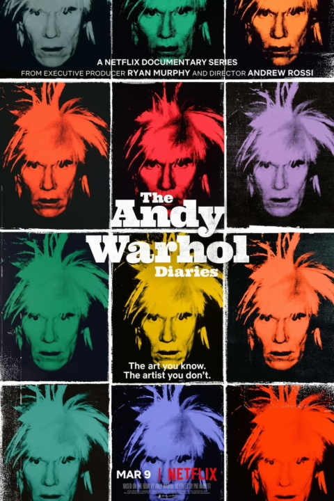
What it is: A docu-series based on the archive diaries of Andy Warhol – creativity, branding, celebrity, the visual collision of pop and design. An invaluable watch in this collection design documentaries.
Why it matters: When you design apparel, music branding, and logos, you are as much in the business of culture as visuals. Warhol lived there.
For you: Think about repetition, color palettes, brand identity, and cultural riffing.
Pro tip: After each episode, ask: What visual motif did Warhol repeat? How did that repetition build the brand? How might you apply repetition in your web design or tee pattern?
Final Words
There you have it. Ten documentaries that matter. Not just “pretty visuals,” but processes, failures, culture, branding, tech, identity. All of that crosses into your world — full-stack dev, logo/apparel designer, musician, pop culture savant.
Here’s how to make them count:
- Watch with purpose: Keep a notebook (or digital one) and write one actionable insight per doc.
- Apply immediately: On your next design project (logo, tee, web), pick one insight and consciously apply it.
- Critique: Don’t be a passive consumer — question what worked, what didn’t, and why.
- Expand: Use each doc’s visual or cultural context to challenge your own work — maybe you pick up a new palette, layout, or narrative style.
Design isn’t just “make something look good” anymore. It’s “make something that works, means something, lives in a culture, and still fits in the code base”. You live at that intersection. These docs will give you fuel.


Leave a Reply